

How to use the top 5 CSS display values: none, block, inline-block, table, and flex
The display property in CSS describes the behavior of an HTML element.
In this article I’m going over 5 different types of CSS display values.
- None
- Block
- Inline-block
- Table
- Flexbox
I’ll go over how each one behaves, the browser support, and perhaps draw a few silly pictures to drive my point.
display: none
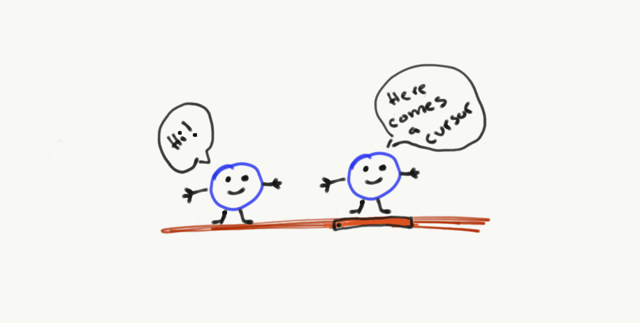
Display none is like a ninja. It makes an element vanish and remains hidden from the user.
Display none is one of the most common, and useful properties that CSS provides.
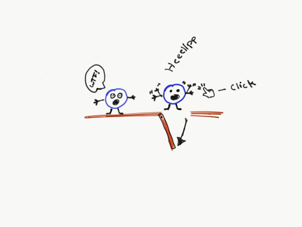
Here’s an example. Let’s pretend that we have a container that has 2 small circles.
And we want to hide the right circle when a user clicks on the container element (the imaginary box around the circles).
What display none does is makes the HTML circle behave as if it’s been deleted.
But the HTML itself never really got deleted. It’s just hiding from the user until told otherwise.
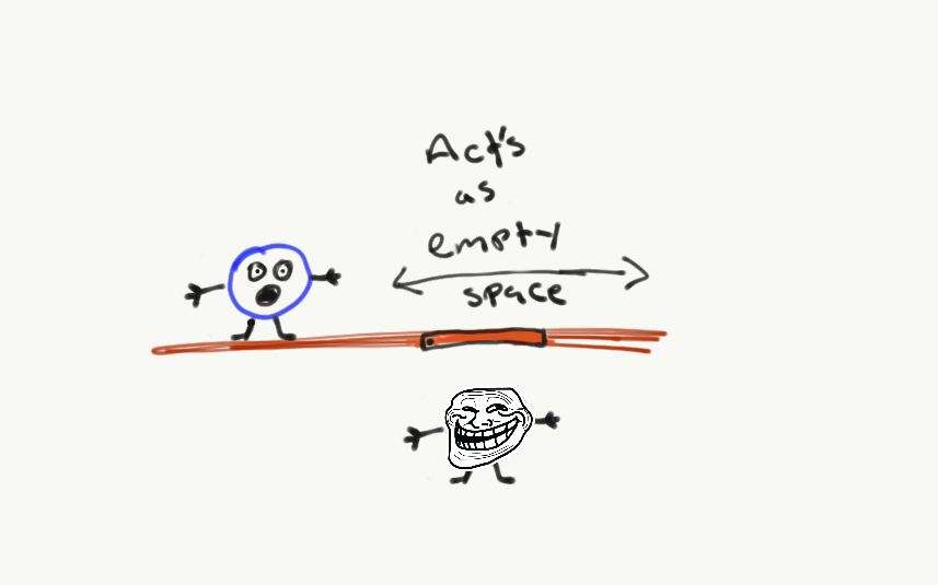
And I can make it reappear when the user does not hover over the container.
Let me show you how this looks like with code.
Here’s what the HTML markup will look like.
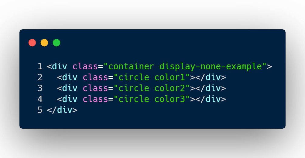
I’ve added a container element with 3 div elements that have a class name, circle.
Now the CSS code that makes the middle circle vanish.
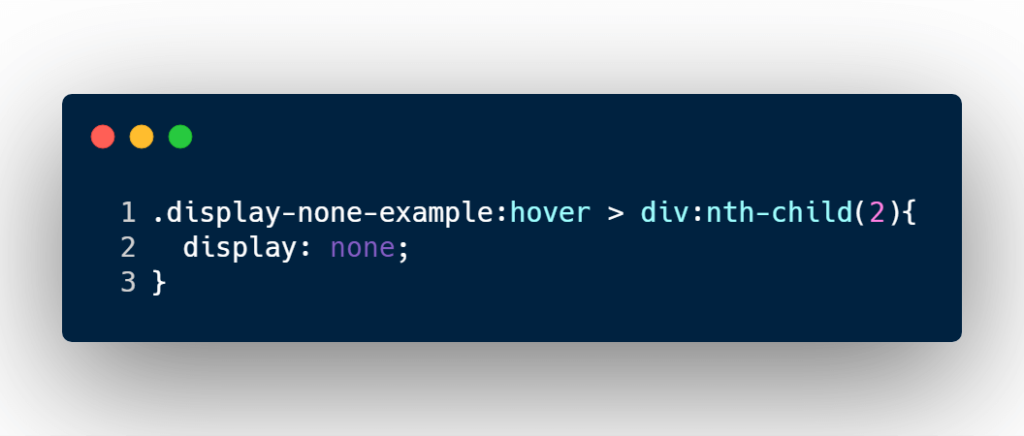
The CSS rule is, when a user hovers the cursor over the container, convert the the second div aka circle, display none.
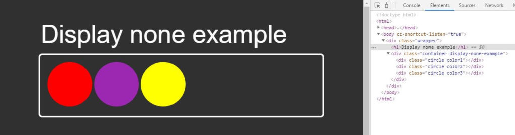
If you take a look at the image above you can see the default view and the HTML markup of the container and circles.
Now what if I force a hover state?
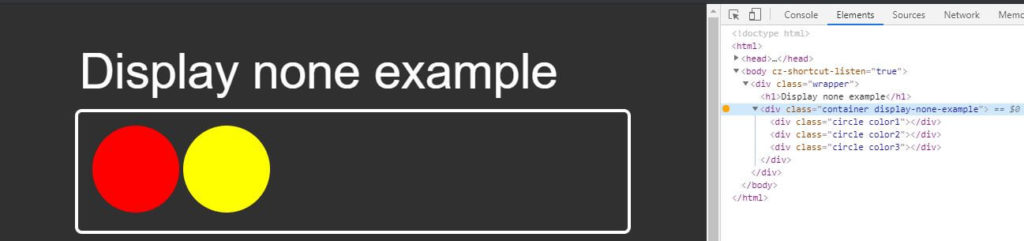
You can see that the middle circle is hidden but the HTML element itself has not been removed as shown on the element dev tools.
You can also see that the yellow circle has taken the spot.
The browser support for CSS display none is Chrome, Firefox, Edge, Safari, and IE6+
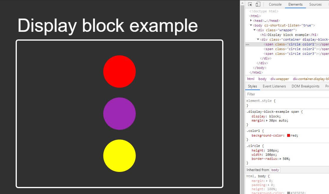
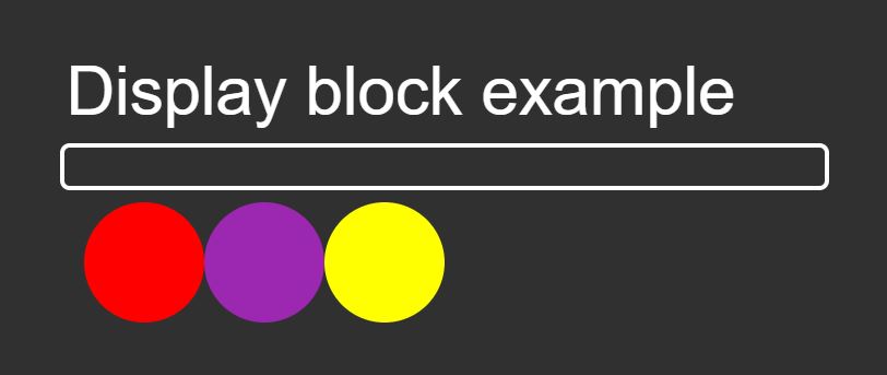
display: block
Display block is selfish and demands respect. It demand to push everything down one line.
Display block will also have a width of 100% unless told otherwise.
As for height, it stays auto unless the developer says it has a height to it.
Display block elements may also have CSS properties such as margin, and padding that may effect the element horizontally and vertically.
Code example time!
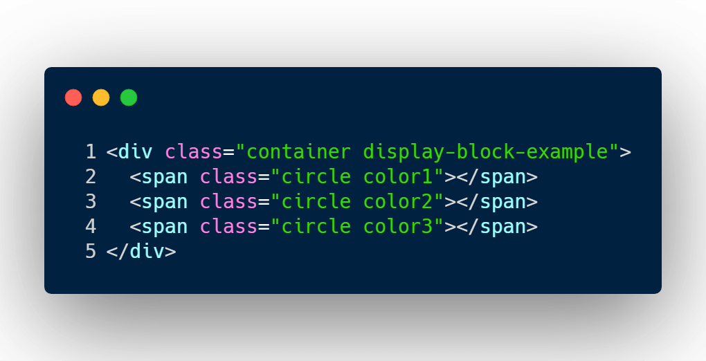
I’m going to use the same markup as above except convert the div element into a span element for the circles.
The reason for this is because by default div’s are blocks, and span elements are inline.
And I want to show in code how to turn any HTML element into a block element.
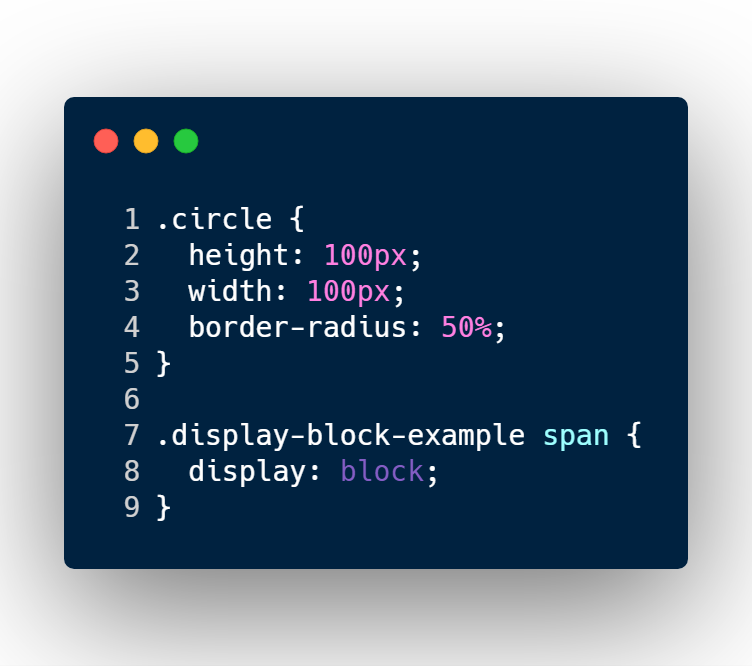
The CSS code is fairly simple.
I’m defining the height, width of the circle to 100 pixels.
In line 8 is where I define the span element to convert to a block type element.
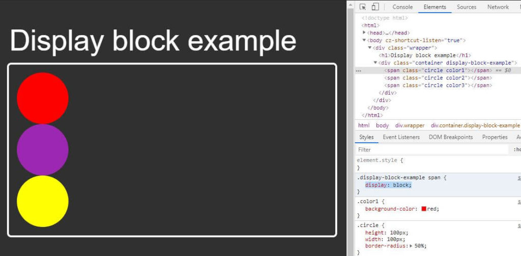
As you can see, the span elements converted to a block type element.
It respected the width and height that I’ve defined, and each circle has pushed the next element in a new line, even if the there is enough space to fit in 1 line.
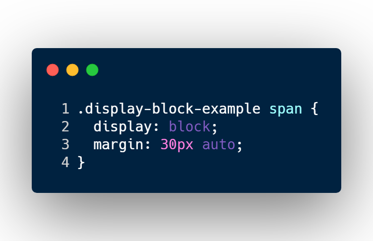
Here’s an example of a block type element respecting margin spacing.
First I’m going to update the CSS code and add a new property of margin.

Display block elements may sit next to each other by giving a float CSS property, but it may cause some awkwardness.
To fix issues like this, you’ll have to add a clearfix CSS class or a some other hacky CSS code.
Avoid using floats with block type elements. It will save you headaches.
The browser support for CSS display block is Chrome, Firefox, Edge, Safari, and IE6+
display: inline
Display inline is the shy, timid type.
Display inline may not be giving height or width.
It may request padding vertically and horizontally. It may also request margin only horizontally.
Since display inline remains pretty fragile and weak, other elements may sit next to them on the left or right side.
And it can’t do anything about it.
Code time!
The HTML will remain the same as the block example, but I will add a different class name to the container element.
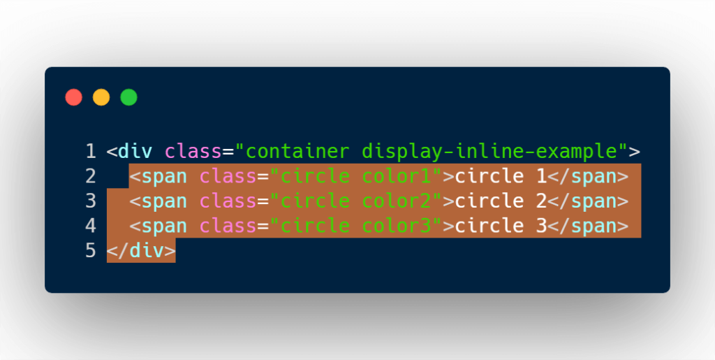
By default span elements are inline element types. So there is no need to define in the CSS display:inline. But if you want to convert any element to inline, well that’s how you would do it.
I will add some padding and margin to the CSS code.
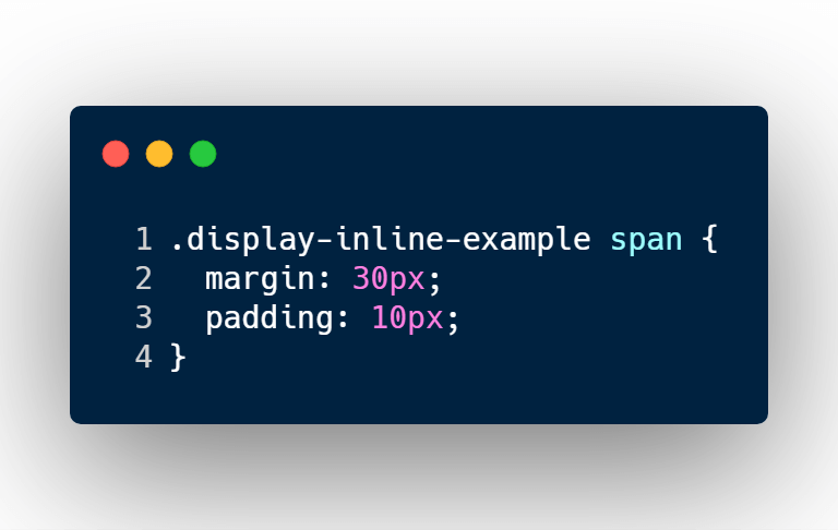
I’ve added margin, and padding space for the top, bottom, left and right sides of each span element.
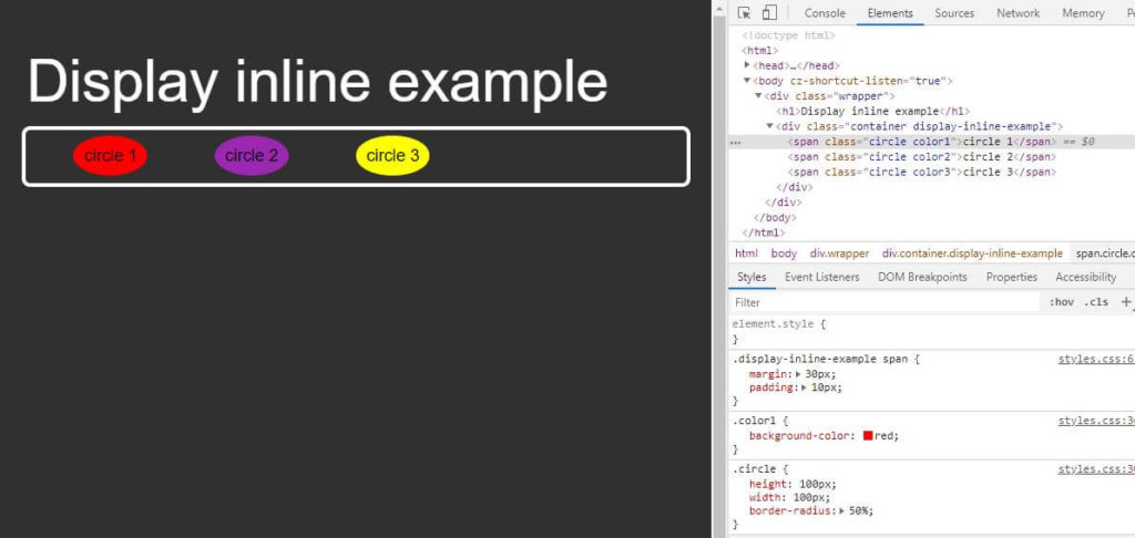
As mentioned above, inline elements will:
- sit next to each other
- not accept width or height CSS rules
- accept padding rules for all sides of the element
- only accepts the horizontal margin rule but not my vertical rules
The browser support for CSS inline is Chrome, Firefox, Edge, Safari, and IE6+
display: inline-block
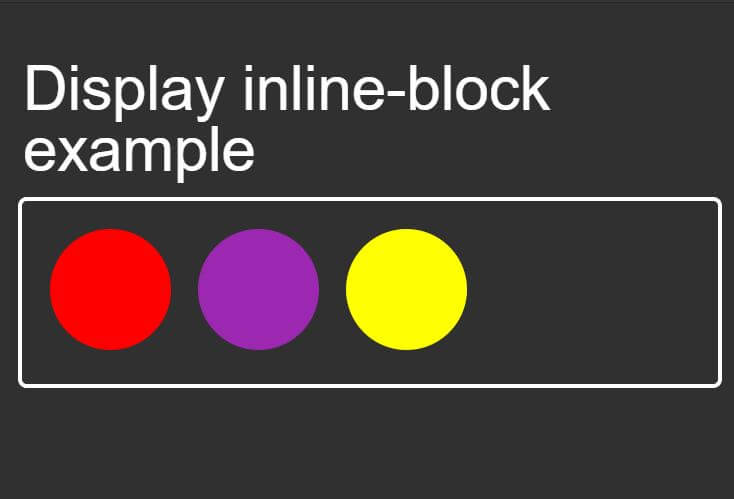
Display inline-block is a team player.
Inline-block can remain small or may grow in height and width.
It’s also accepts horizontal, and vertical padding and margin spacing.
Unlike block type element, it tolerates other elements to sit next to it if enough space is available.
Let’s take a look at the HTML code.
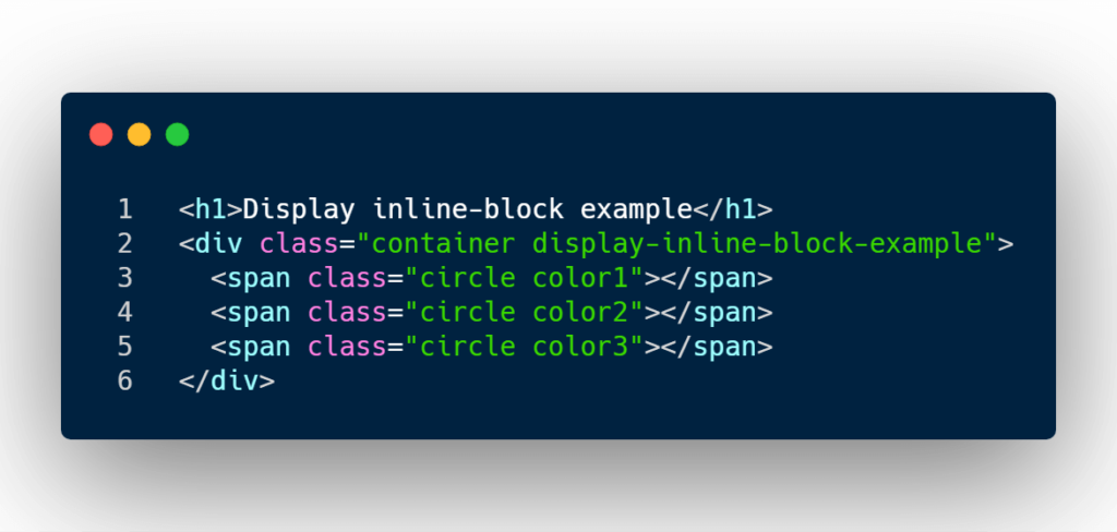
The code above is using the span element tag to represent the circles.
By default span elements are inline element types. So I need to convert them into inline-block types and I’m going to add some padding and margin on each side of the elements.
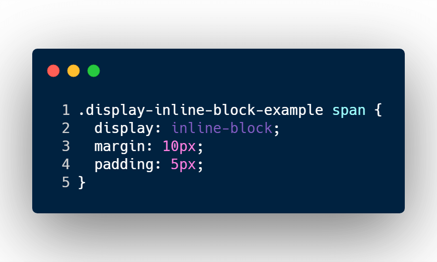
And just like that you can convert each span element into an inline-block element type.
Let’s take a look at the properties that it accepted.
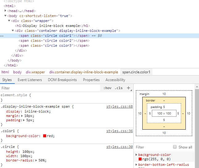
As you can see each span tag has accepted that following CSS properties:
- width
- height
- margin
- padding
and still sit next to each other as inline element types would.
The browser support for CSS inline-block is Chrome, Firefox, Edge, Safari, and IE6+.
display: table
Back in the 90’s using table elements was how a web page was structured, and sadly HTML email templates still use this old protocol.
Even though 99% of the time we don’t use the table elements anymore, the layout is still available in CSS.
One of the benefits of using table layouts is that we can achieve equal heights for each column in a row. Which maybe difficult to achieve using block and inline-block.
Another benefit is also positioning elements in the center of a box by using 2 to 3 lines of CSS code rather than the position trick or even JavaScript code.
Gross.
Let’s take a look at an example how we can utilize the table suite of values to center an element vertically and horizontally.
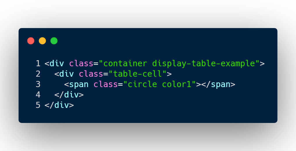
There is a little bit more markup than our last few examples.
I’ve added a div around the circle element and gave it a class name table-cell.
In the last few examples, I haven’t had the need to style the container element.
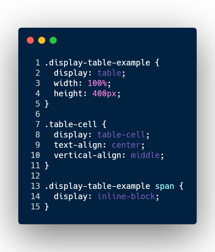
But in this case we need to, I needed to write in the CSS to convert the container element into a table type element.
I also gave it a width 100% and a fixed height of 400px.
The next CSS rules apply to the table-cell class. which is the div that wrapped around the circle span element.
I must define in the CSS that table-cell is display type of table-cell.
I also gave it text align, and vertical align to equal center. These 2 CSS property rules will help move children elements to move to the center of the table-cell element.
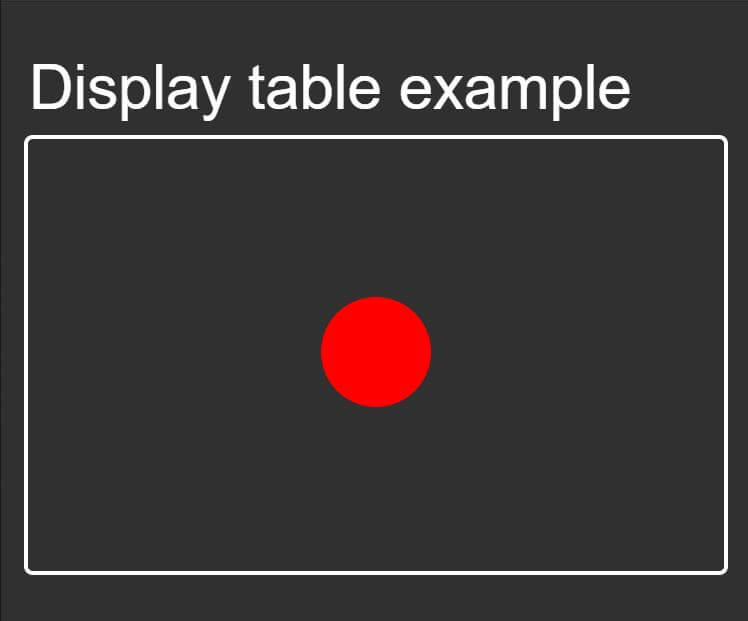
As you may see, those CSS rules allowed me to achieve to put the circle element in the middle of the box.
Let’s take a closer look at how table-cell behaves.
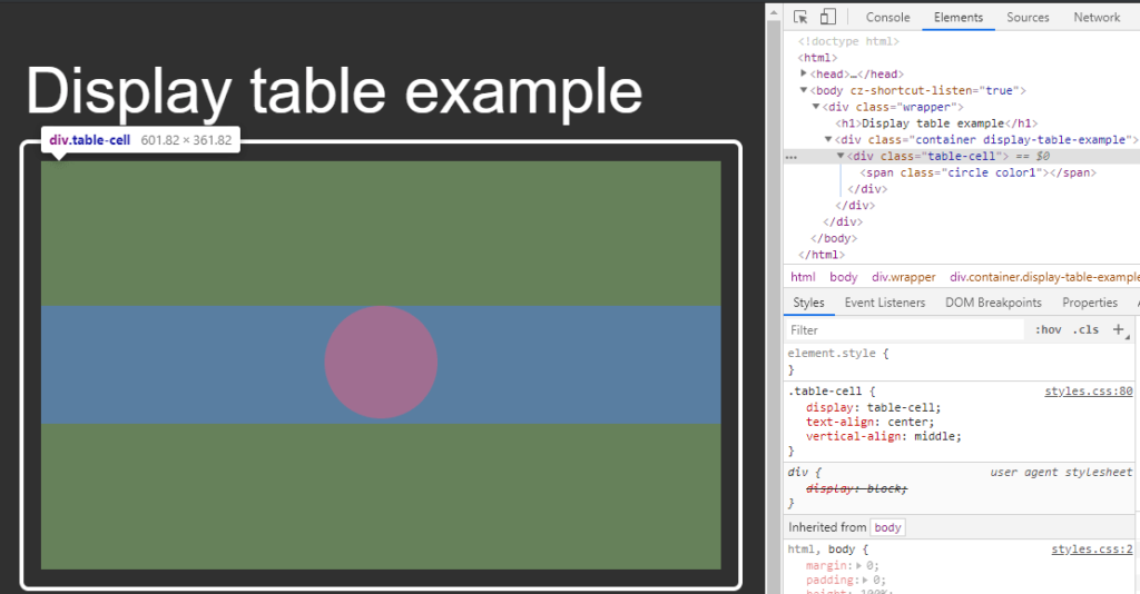
table cell element types by default take 100% width of parent element. No where in the CSS rules did I say to use 100% and use any other hacky methods to achieve this goal.
All I needed to tell the table-cell element was to align things in the center.
The browser support for CSS table layouts is Chrome, Firefox, Edge, Safari, and IE8+
display: flex
At the end, all we’re trying to do with the display property is to achieve a specific grid layout.
But each individual value has its limitations that requires the engineer to do some hacky methods.
This is where flexbox comes to save the day.
The main goal for flexbox is to give the engineer the ease to create more efficient layouts.
It allows you to alter items within a container by width, height, and order to best fill in the space.
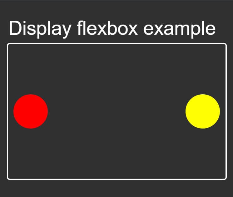
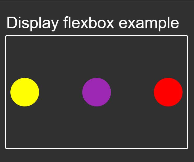
Let’s look at an example. The goal will be to align 2 circles in the middle and push them on each side.
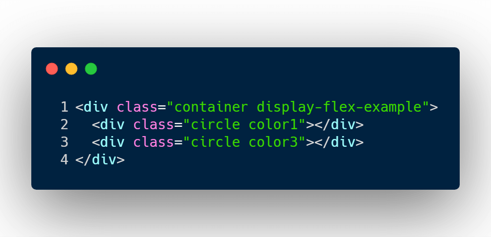
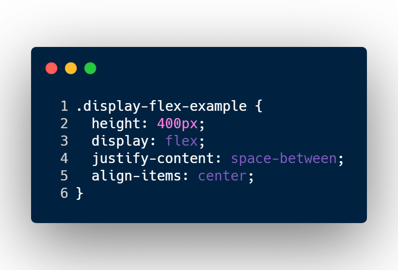
The only HTML element I need to style is the container element.
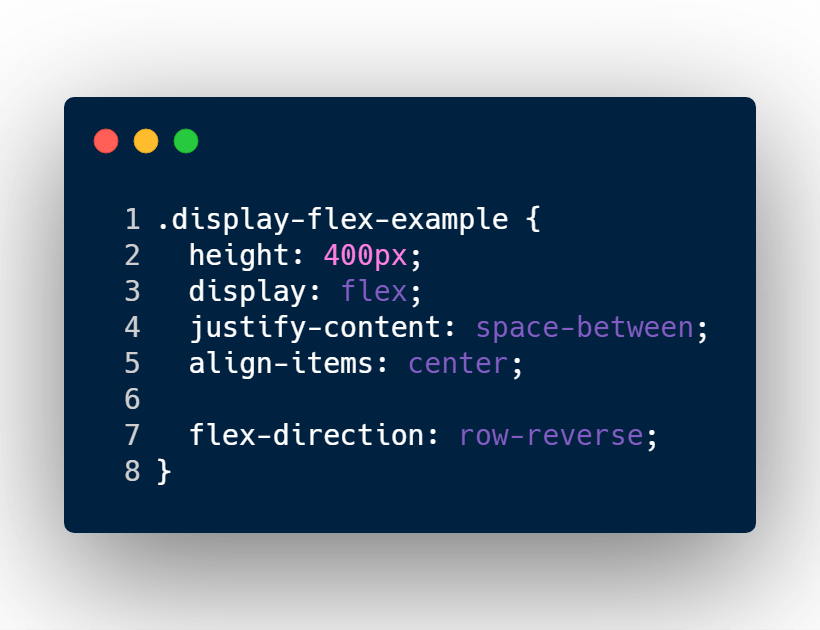
The CSS rule is defining a fix height, a display type of flex.
It’s also manipulating the position layout of the children elements by evenly distributing the items and aligning them vertically in the center of a 400px box.
Look how easy that was to do! But what if I add another circle? Will they be evenly distributed still?
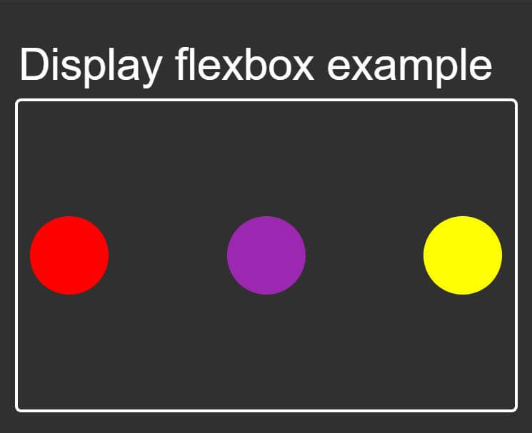
Yes it is!
Display flex has a number of flex CSS properties that allow you to manipulate the layout extremely easily.
Another quick example is reversing the items. So the yellow box is on the left side, and the red box is on the right side.
The HTML structure will not change. All I need to do is add 1 more CSS property called flex-direction.
The browser support for CSS flexbox is Chrome, Firefox, Edge, Safari, and IE10+
Github source:
https://github.com/rleija703/css-examples/tree/master/with-display
I like to tweet about CSS and post helpful code snippets. Follow me there if you would like some too!