A simple example to understand CSS Transition

So you want to add CSS transition to all properties in an element except one?
This can be easily achieved by adding extra transition rules in the same line.
Let’s get started.
The CSS transition objective
The goal for this guide is to create a box.
This box will have height, width, border, background color defined.
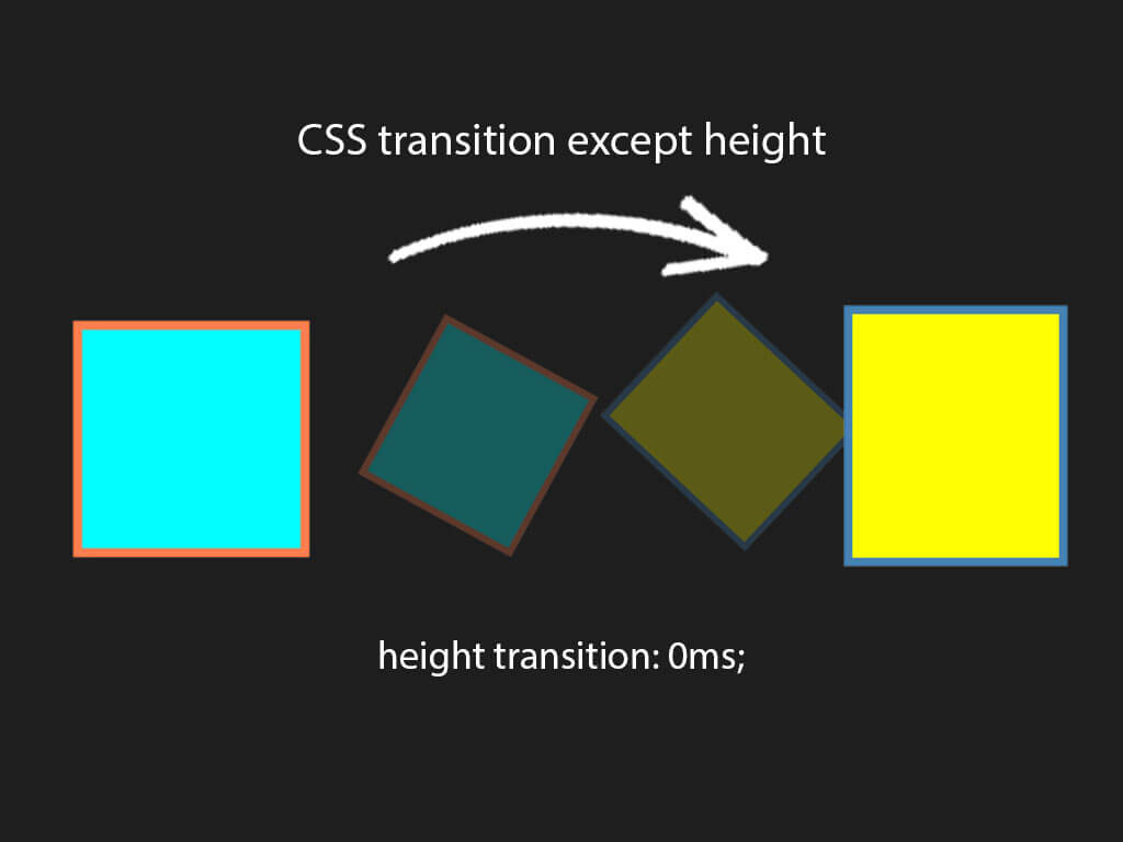
I will make it that when a user hovers over the box the following properties will change:
- box height
- box width
- box border-color
- box background color
All of those CSS properties will have a smooth transition except height.
And to spice it up a bit, I will add a 180 degree spin with CSS transform.
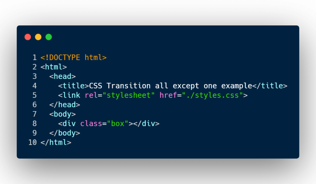
Step 1: Creating the HTML markup
<!DOCTYPE html>
<html>
  <head>
    <title>CSS Transition all except one example</title>
    <link rel="stylesheet" href="./styles.css">
  </head>
  <body>
    <div class="box"></div>
  </body>
</html>
The markup is fairly simple.
All I’ve done is create a simple HTML div element with a class name of box.
Time for the fun part, the CSS code.
Step 2: Add the CSS code and transition
.box {
  background-color: aqua;
  border: 12px solid coral;
  height: 300px;
  width: 300px;
  box-sizing: border-box;

  /*
   * You can add multiple transitions in 1 line.
   * To make a specific CSS property not to transition
   * give it a duration of 0ms.
   */
  transition: all 1s ease-in-out, height 0ms;
}
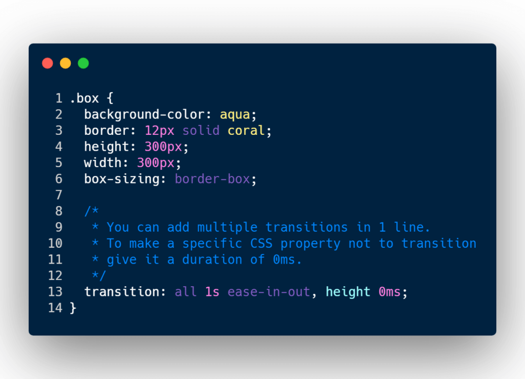
Here’s the initial CSS code for the box.
I have given the box a height and width of 300px.
I’ve also given the box a thick border with a coral color.
And the background color of the box is aqua.
On line 13 is where the magic happens.
I’ve given the box a transition property.
The transition property is saying to give all the properties for this box a smooth transition over a duration of 1 second.
Except make the height transition 0 milliseconds.
0 milliseconds will be a instantaneous change.
Also notice that you can add multiple CSS transition rules by adding a comma.

Now to make this transition take into effect, let’s add some CSS hover selector to the CSS code.
.box:hover {
  background-color: yellow;
  border-color: steelblue;
  transform: rotate(180deg);
  height: 350px;
}
When the user hovers over the box the background color, border color, height will change, and the box will have a 180 degree spin to it.

Conclusion
If you want to animate or apply a smooth transition to all the CSS properties except one or many, just define in the transition CSS property that specific CSS property and give it a transition duration of 0 milliseconds.
Happy coding!
I like to tweet about CSS code snippets and post helpful code snippets. Follow me there if you would like some too!


