

Building a tabs component with Svelte
If you ever build an application, web or native, then there’s a good chance you’ve seen a tabbed interface.
Even the bottom navigation of Instagram can be seen as a tabbed interface.

Tabs make it easy to explore and switch between different views.
In this article you will learn how to create a simple, and reusable Svelte tabs component.
You’re going to create 2 components.
The first Svelte component will be called Tabs.
Tabs will display a list of clickable tabs. It will hold it’s own state for which active tab is active, and it will pass the active tab value to the parent component.
The second Svelte component will be called App.
The App component will utilize the Tabs component and delegate what view to display depending on which tab is active.
Let’s get started.
Building the Tabs Svelte component
<script>
  import { onMount } from "svelte";

  export let items = [];
  export let activeTabValue;

  onMount(() => {
    // Set default tab value
    if (Array.isArray(items) && items.length && items[0].value) {
      activeTabValue = items[0].value;
    }
  });

  const handleClick = tabValue => () => (activeTabValue = tabValue);
</script>

<ul>
  {#if Array.isArray(items)}
    {#each items as item}
      <li class={activeTabValue === item.value ? 'active' : ''}>
        <span on:click={handleClick(item.value)}>{item.label}</span>
      </li>
    {/each}
  {/if}
</ul>

<style>
  ul {
    display: flex;
    flex-wrap: wrap;
    padding-left: 0;
    margin-bottom: 0;
    list-style: none;
    border-bottom: 1px solid #dee2e6;
  }

  span {
    border: 1px solid transparent;
    border-top-left-radius: 0.25rem;
    border-top-right-radius: 0.25rem;
    display: block;
    padding: 0.5rem 1rem;
    cursor: pointer;
  }

  span:hover {
    border-color: #e9ecef #e9ecef #dee2e6;
  }

  li.active > span {
    color: #495057;
    background-color: #fff;
    border-color: #dee2e6 #dee2e6 #fff;
  }
</style>
This is a lot to digest. I’ll walk you through the code.
Let’s take a look at the <script> tag logic first.
<script>
  import { onMount } from "svelte";

  export let items = [];
  export let activeTabValue;

  onMount(() => {
    // Set default tab value
    if (Array.isArray(items) && items.length && items[0].value) {
      activeTabValue = items[0].value;
    }
  });

  const handleClick = tabValue => () => (activeTabValue = tabValue);
</script>
First I’m importing the onMount hook from Svelte, but I’ll explain why in a bit.
I’m then creating 2 component props for Tabs.
The first component prop is items.
items will be a an array of tab navigation items.
The other component prop in Tabs is activeTabValue.
This an important property because it will hold the value of the active tab item, and it will toss the value back to the parent component to dictate what to display to the user.
Okay, back to onMount. onMount is critical here as well because I’m setting the first tab item as the default active tab.
I’m also creating a click handler function called handleClick().
The job for that function is update the value of activeTabValue.
Now let’s look at the HTML.
<ul>
  {#if Array.isArray(items)}
    {#each items as item}
      <li class={activeTabValue === item.value ? 'active' : ''}>
        <span on:click={handleClick(item.value)}>{item.label}</span>
      </li>
    {/each}
  {/if}
</ul>
This part is pretty simple. All I’m doing is adding a if-block conditional to make sure items is an array.
I’m also adding logic to the class property on the li element.
<li class={activeTabValue === item.value ? 'active' : ''}>
I’m just checking whether I need to add the active class name to the element.
The rest is just CSS styles.
Now, on to the App Svelte component!
Building the App component
This Svelte component is the main view for the user, and will utilize Tabs to display the menu.
It’s also responsible to show the appropriate content.
<script>
  import Tabs from "./Tabs.svelte";

  // List of tab items with labels and values.
  let tabItems = [
    { label: "Tab 1", value: 1 },
    { label: "Tab 2", value: 2 },
    { label: "Tab 3", value: 3 }
  ];

  // Current active tab
  let currentTab;
</script>

<Tabs bind:activeTabValue={currentTab} items={tabItems} />

<code class="language-text"></code>

{#if 1 === currentTab}
  <h3>Tab 1 content</h3>
{/if}

{#if 2 === currentTab}
  <h3>Tab 2 content</h3>
{/if}

{#if 3 === currentTab}
  <h3>Tab 3 content</h3>
{/if}
Code breakdown!
Starting with the <script> tag.
<script>
  import Tabs from "./Tabs.svelte";

  // List of tab items with labels and values.
  let tabItems = [
    { label: "Tab 1", value: 1 },
    { label: "Tab 2", value: 2 },
    { label: "Tab 3", value: 3 }
  ];

  // Current active tab
  let currentTab;
</script>
Other than importing the Tabs component, I’m creating a variable called tabItems.
tabItems is what creates my tab menu.
I’m also creating a state property called currentTab.
currentTab will hold the value of the active tab inside the Tab component.
{#if 1 === currentTab}
  <h3>Tab 1 content</h3>
{/if}

{#if 2 === currentTab}
  <h3>Tab 2 content</h3>
{/if}

{#if 3 === currentTab}
  <h3>Tab 3 content</h3>
{/if}
I’m also using currentTab in if-block conditionals to determine what is the right content I want to display to the user.
Now, how in the world is the value of currentTab being updated to display the right content?
Let’s look at the use of the <Tabs /> directive.
<Tabs bind:activeTabValue={currentTab} items={tabItems} />
When using the Tabs directive, I’m passing the menu navigation down. But to update the currentTab state property, I’m using the special keyword bind.
bind:property let’s you pass children component values (props or state) upward.
You can see that I’m telling Svelte to bind:property the variable currentTab with the component property activeTabValue.
I do this by writing it as such, bind:activeTabValue={currentTab}.
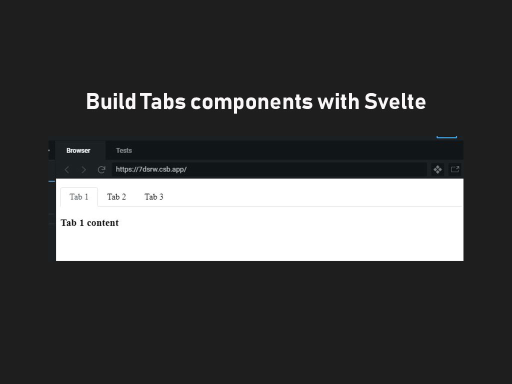
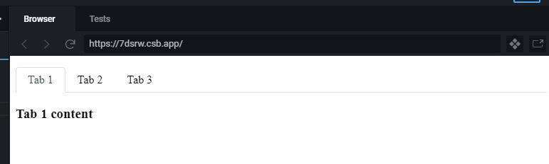
And if done correct, the output should look like this
I like to tweet about Svelte and post helpful code snippets. Follow me there if you would like some too!